
Typography that tells your story
Remember the last time you watched text appear on screen and couldn't look away? That magnetic pull isn't accidental. When words animate before your eyes, something special happens in your brain. You lean in. You pay attention. You remember.
VideoScribe's hand-drawn text animations tap into this psychological goldmine. Unlike static slides or jarring transitions, watching words being written mirrors how we naturally process information—one thought flowing into the next. Let's explore how to harness this power and make your messages unforgettable.
Your font choice speaks before your words do
Every font carries emotional baggage. Comic Sans screams "casual Friday gone wrong" while Helvetica whispers "I mean business." VideoScribe's built-in font library gives you dozens of personality-packed options, each waiting to amplify your message.
Think about your audience first. Teaching kindergarteners? Rounded, friendly fonts like Quicksand create warmth. Pitching to C-suite executives? Clean, professional typefaces like Roboto command respect. Research shows 75% of consumers judge brands by their typography—so choose wisely.
Font pairings that sing in harmony
Great typography is like a duet—two voices that complement without competing. Here are eight Google Font combinations that create visual magic in VideoScribe:
1. Montserrat + Open Sans
The modern marketer's dream team. Montserrat headlines grab attention with geometric confidence, while Open Sans body text keeps things readable and approachable. Perfect for product demos and explainer videos.
2. Playfair Display + Source Sans Pro
Old-world elegance meets Silicon Valley simplicity. Use Playfair's dramatic serifs for impact statements, then let Source Sans Pro handle the details. Educational content and thought leadership pieces love this combo.
3. Oswald + Lato
Bold meets balanced. Oswald's condensed punch makes titles pop, while Lato's humanist curves keep lengthy explanations friendly. HR teams love this for internal communications that need both impact and warmth.
4. Lobster + Roboto
Retro flair with modern balance. Lobster's bold, vintage script makes for eye-catching headers full of charm, while Roboto's clean lines keep the body text grounded and readable. Great for promotional content and creative brand storytelling.
5. Raleway + Merriweather
Sophistication without stuffiness. Raleway's thin elegance pairs beautifully with Merriweather's readable serifs. Ideal for storytelling, case studies, and any content that needs to feel both professional and personal.
6. Permanent Marker + Open Sans
Streetwise energy meets corporate clarity. Permanent Marker's graffiti-style strokes inject personality and edge, while Open Sans keeps your message crisp and accessible. Use this combo for informal how-tos, startup intros, or youth-focused messaging.
7. Caveat + Fira Sans
Expressive yet grounded. Caveat adds a personal, energetic signature to your titles, with Fira Sans ensuring legibility and structure below. A great choice for testimonial videos or behind-the-scenes content.
8. Amatic SC + Josefin Sans
Quirky elegance in motion. Amatic SC's tall, skinny handwritten forms feel handmade and charming, while Josefin Sans brings a vintage-modern chic to the body. Ideal for creative portfolios or project showcases.
Level up with custom fonts (Max plan magic)
Your brand spent months perfecting its visual identity. Why abandon it in your videos? VideoScribe's Max plan lets you upload custom fonts, keeping your typography on-brand across every touchpoint.
Imagine your company's signature typeface drawing itself across the screen, reinforcing brand recognition with every stroke. Marketing teams report 40% better brand recall when using consistent custom fonts across video campaigns. The upload process takes seconds, but the impact lasts forever.
Making text pop like popcorn
Great fonts are just the beginning. Here's how to transform good text into great animation:
- Size matters: Make key words 30-50% larger than supporting text. Your viewer's eyes will thank you.
- Color with purpose: High contrast isn't just accessible—it's attention-grabbing. Dark text on light backgrounds (or vice versa) creates visual anchors.
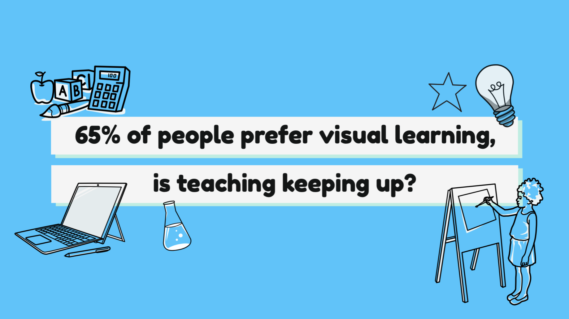
- Time your reveals: Let important phrases linger before moving on. Since 65% of people are visual learners, giving them time to absorb matters.
- White space is your friend: Don't crowd the canvas. Let text breathe with generous margins.
Discover professional techniques for making your text animations stand out.
The hand-drawn difference: Why it works
Static text dumps information. Hand-drawn text tells stories. When viewers watch words being written, their brains activate differently than when reading static text. They're not just seeing—they're experiencing.
This isn't just feel-good philosophy. Studies show viewers retain 95% of messages from video versus 10% from text. The hand-drawn style amplifies this effect by creating anticipation. Each stroke builds suspense. Each word reveals meaning gradually, mirroring natural thought processes.
Teachers report students staying focused 3x longer with hand-drawn animations. Sales teams see 20% higher engagement rates with animated content. HR departments find employees actually complete training videos instead of skipping ahead.
Your typography transformation starts now
Every word you animate is an opportunity. An opportunity to connect, to teach, to inspire. VideoScribe's text animation tools give you the power to turn simple messages into memorable experiences.
Start with the font pairings above. Experiment with timing. Upload your brand fonts if you're on the Max plan. Most importantly, remember that great typography isn't about following rules—it's about serving your audience.
Whether you're explaining complex concepts to students, rallying your sales team, or launching your next marketing campaign, animated typography helps your message stick. Because when words come alive, so does understanding.
Ready to make your words move mountains? Start your VideoScribe free trial today and discover how the right typography can transform your storytelling.
.png "VideoScribe")


![How to create animation magic [3-part guide to video success]](https://blog.videoscribe.co/hubfs/How%20to%20create%20animation%20magic%20guide%20VideoScribe.png)
.jpg)


COMMENTS