
Do you ever start creating a video by adding images onto your screen and think - “okay, what now?”.
With a blank canvas in front of you the options can seem endless. Should you focus on one image per point? Or is it better to add a full background so there’s more for the eye to look at? That’s where video design comes in.
Video design might sound complicated, but it doesn’t have to be. By following a couple of simple principles you can enhance the storytelling power of your animations and ensure a great viewing experience. Which is why in this guide we’ll be walking you through a few basic rules that professional animators follow to create polished videos, and how you can too.
About the Author

Louis Domaille is Sparkol’s Design Lead and as the creative mastermind behind our bespoke animation agency, Sparkol Studio, he knows what it takes to create a stand out video. Louis has created animated videos for some of the world’s biggest brands including American Express, Nissan and Lyft.
In the process he’s honed his design skills, consistently delivering animations that perfectly match the tone, message and objectives of our clients. We thought it was only right he shared an insight into his process with you.
You can read this guide from start to finish or hop between sections using our options below.
1. Safe zones - what they are and how to use them
2. The rule of thirds explained
3. Leading the focus with image positioning
Ensuring design consistency:
1. Color and typography - building your palette

First things first, when I’m designing anything I have two main points on my mind - clarity and consistency.
Clarity because fundamentally it’s crucial that our audience understands our message, our focus and what to do next. It’s all about getting the point across with ease. Then we have consistency, which is where we tie the styling of the video together to give it a professional feel. Plus, when we represent things in a similar way, it solidifies the message. So, let’s look at how we can achieve both.
Clarity
To achieve clarity of message, there are a couple of design guidelines that I always stick by. I say guidelines as they’re not absolutely set in stone but broadly following them should ensure your finished video is easily understood by anyone. We’ll start things off with ‘safe zones’.
Safe Zones
These are the areas of the screen that all your content should fit into. There's a few reasons to do this, one of them being that if an element (text/image/photo etc.) is worth showing then it’s worth giving it the room and breathing space it deserves. This will also improve legibility of text and understanding of the scene. If an element in your scene doesn't deserve that space, then I’d question why you’re including it in your video at all.
The second main reason is that all your elements can actually be seen!
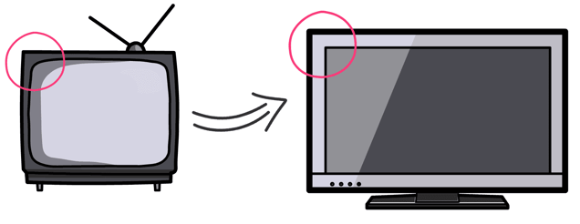
Safe zones are an old concept from the very beginning of moving images. If you think that TVs started with curved edges like the one below. Safe zones had to be used to ensure images weren’t cut off. Then technology progressed and we got nice high definition TVs in a standardized 19:9 ratio and we didn’t need to worry so much about safe zones.
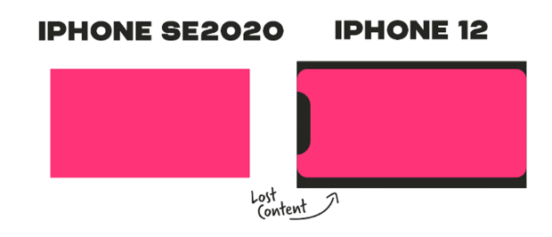
And then we took a further step forward and ended up in a similar position to before. Most smartphones now have rounded edges and some like the iPhone also have front cameras that cut into the screen. You can see the impact this has on video clarity below.
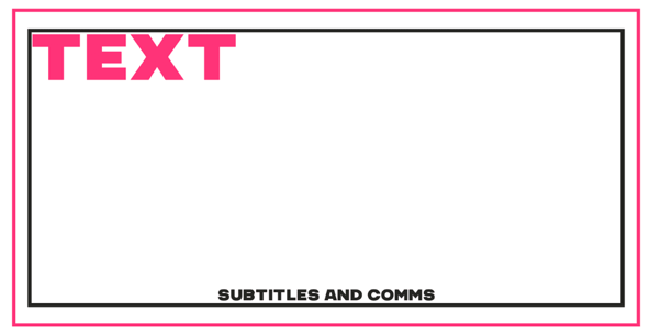
It’s for these reasons that I like to use two safe zones, an outer one for any visual elements and inner one for all text elements. In this example, all of my text, be it headings, subtitles or labels are inside my inner safe zone. I’ve found that best practice for this inner zone is about 80% of my screen, so 10% left at the top, 10% at the bottom, 10% left and 10% right.
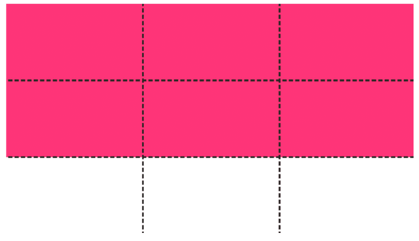
The Rule of Thirds
Now let’s take image and text placement one step further. Aside from ensuring all your elements can be seen, you can reinforce your message and focus on specific points by placing images and text in certain parts of your screen.
For this we use a principle called the rule of thirds. It simply means dividing your screen with four lines to create nine different sections and four focal points.
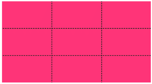
This then forms a very simple guide to help position content on your screen. You can use this in a few ways:
- Focus in on the four focal points created by the intersecting lines
- Focus on the lines themselves to space elements evenly
- Focus on the shapes created by several of the boxes i.e. a bottom third section of the screen. Next time you’re watching TV, keep an eye on these areas and you’ll notice that this is where the majority of all text sits. Names of presenters, job titles, they're all be positioned in here.
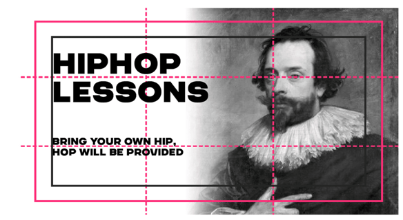
Example 1: Hiphop lessons
In this case the image fades into white in the middle of the screen and then the title and subtitle straddle the upper and lower third lines. The man’s eye is also set on the upper right focal point where the lines cross. This helps us focus on his expression. All of the elements are also within our safe zones as indicated by the inner and outer borders.
Example 2: A timeline
In another super simple example, we can see that by placing the key point in the timeline on one of those focal points, our eye is naturally drawn there. Plus, because the Instagram logo is positioned higher than the rest of the scene, it tells us it’s the most important point.
The lower third line also provides the perfect base for the scene, locking all the elements in with plenty of space.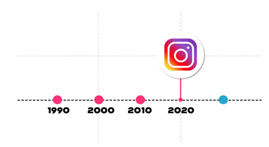
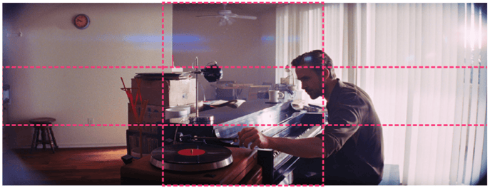
Example 3: La La Land
This final example might look a bit more familiar, it’s a scene from the award-winning film, La La Land. Here we see Ryan Gosling is perfectly positioned on the right-hand line and we follow his focus down onto the record player in the bottom third of the screen.
So, while the rule of thirds might seem like a very simple principle, it’s deceptively effective and used by almost all video producers from amateurs to professionals.
Leading the focus
Now, let’s talk about leading the focus. The vast majority of videos are about relationships between two or more objects. You could be saying one is better than the other, one is worse, one is more important, or each of these things make one thing better.
To bring that relationship to life on the screen, we can get creative with how to draw audience focus in. Here are some examples to help illustrate this effect.
Balance
By placing two of the same sized objects either side of the main element, you’re creating balance in the scene while highlighting that the middle element is the best/most important.

Contrast
You can draw attention with color too - this could be highlighting a positive or a negative. So consider your choice of color carefully to suit your message.

Hierarchy
As we saw in our timeline example, where you position elements on the screen can send additional messages. In this case, the top circle is our focus because we perceive it to be better as it’s on the top.

Proximity
You can also use space to highlight differences. Our free floating circle could show a brand breaking away from the pack or a new idea that’s different to other theories.

Now we’ve got the principles of clarity nailed, we can start putting them all together. Our ladder scene below is a perfect example of this. The ladder is positioned on the left-hand third line, the stage labels on the right. This creates the perfect starting composition and ensures each element has the right amount of space.
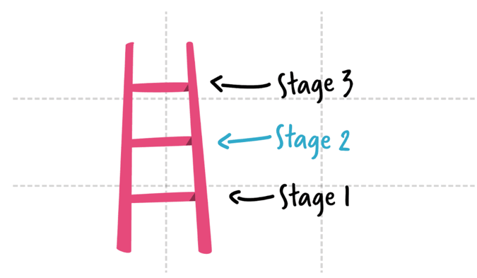
From there, we’re considering hierarchy and physically showing that stage 2 is more important than stage 1 but perhaps not as important as stage three. However, the contrast in color of stage 2 draws our focus in and tells us this is what we’re talking about in this scene. It’s as easy as that!

Consistency
That’s clarity covered, now consistency is where we can tie the styling of the video together to give it a more professional feel. Plus, when we represent things in a similar way, it links them.
As we’ve shown in previous sections. If there’s a pattern that's broken our attention is drawn to what’s broken it. That can be helpful when we’re trying to attract attention, but not when it’s so much it becomes distracting. So, how do you strike that balance?
Color and Typography
One of the easiest ways to achieve consistency is with your choice of colors and fonts. Simply by ensuring you’re using one or two of the same fonts throughout your animation, you can make your video a whole lot more professional.
Either use your brand fonts or pick a couple that go well together. Look for one font that’s more structured and bold that you can use for headings and key information. Then partner it with a looser contrasting font that can be used for subheadings, captions and details. You can see an example of this below.

When it comes to color, again less is more. Pick one cohesive color palette and stick to it throughout your video. This will help you draw attention to important information more easily. After all, if your whole video is full of different colors, how will your audience know that bright yellow elements are particularly important?
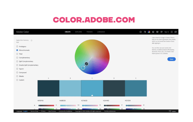
If you’ve already got a brand defined color palette then that will work perfectly, otherwise you can build your own palettes using tools like Adobe Color. As you can see below, there’s lots of options
for different color sets including complementary, monochromatic and analogous (learn more about the color wheel with our guide). These will each give you a different range of colors based around one central color of your choice.
I really recommend using this because not only will it throw up colors you’ve never even thought of using but it makes working out what colors go well together a whole lot easier!
 And that’s a wrap! Those are the principles I follow to kick off every video I work on. They ensure I’ve got a slick base to work with that I can build on from there.
To test these principles out in your own video, start a free 7-day trial of VideoScribe or join our creative community of VideoScribers by clicking below 👇

.png "VideoScribe")


![How to create animation magic [3-part guide to video success]](https://blog.videoscribe.co/hubfs/How%20to%20create%20animation%20magic%20guide%20VideoScribe.png)
COMMENTS